Tuesday, 30 April 2013

Is Tech Back?

One of the stories of the last 4+ month rally in the S&P is actually how poorly Tech has been.  YTD, the SPDR Tech ETF XLK has only gained 6.7% vs the S&P at 12.1%.

For a sector that typically outperforms during market rallies, this was very unusual.  In the last week however, something seemed to have changed in the market.

In the last 2 weeks since the minor bottom, the SPY has jumped 3.5% or so.


Tech however has jumped 5.5% in that same time frame.  Now you may say that isn't much, and its true, while large, its not a huge difference in absolute terms.  However, for a sector that has been underperforming for almost half a year now, its notable that something may have changed.  Is the market sectors finally starting to rotate out of the defensives and non-cyclicals that's been powering this rally?


Looking at the Health Care sector, one of the big drives of the S&P in the last 4+ months, you notice that in the last 2 wks, it has leveled off.  So the recent S&P jump is now starting to be driven by a different sector.  This is a somewhat healthy observation as it means there is other market leadership and the breadth of advances is improving.


Monday, 29 April 2013

Light Postings Lately

Unfortunately, postings and updates have been somewhat light the last week or so.  Its been a combination of a few things, just lack of free time lately, and two, not much to talk about in the market.

Though the market has hit new highs and there has been some more volatility lately, there really isn't that much going on.  Reading on various financial sites, it seems almost everyone is just consumed with wondering if this rally is sustained or will come crashing down soon.  Result of debate: inconclusive.

A couple of links I read recently on interest.

Cheap Tech Stocks

Fusion Research Market Summary


(Bespoke Invest)


Tuesday, 23 April 2013

Twitter and reliability of the new instant news

I saw a few blog posts out during the Boston bombing and the subsequent car chase the day or so after.  They were praising twitter and how it was now the new tape and the real source for instant news.   Hey I'm all for new technology as much as the next guy but you have to keep in mind what twitter is: an unfiltered and noisy crowd.

Today was a case in point:


(From: Arstechnica)

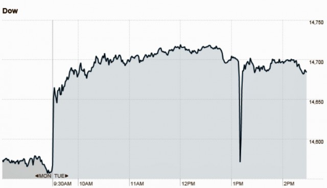
I saw it in the afternoon and had a WTF moment.  Apparently AP's twitter was hacked and falsely reported a bombing at the White House.  Market's reacted and plummeted.

So keep that in mind, with instant news also comes instant risk.

Monday, 22 April 2013

EPA Fuel Efficiency

There was a variety of sources for my fuel efficiency article but one of the main ones is from the EPA: Gas Mileage Tips.  While the tips are right and the arguments are mostly correct, I do wonder a bit about some of their numbers as there's a few in there that seems just a tad high to me.

I tried crunching some of the numbers to be sure but they don't always show the sources and references to do data analysis on.

Oh well..c'est la vie.

Most of the times I wrote about I was able to at least some corroborating information on and based on some equation and modeling work back in my college days.  Ah, the good ole days of solving fluid flows equations...    

Wednesday, 17 April 2013

S&P 500 - still a long ways to go

For all the chatter this week about the market volatility and drops, you would think we've started a massive down spike already.  Earlier today, a CNBC guest was asked if we're at the bottom already.  I was in disbelief.  

We just hit an all time peak 4 days ago.  We're still so very close to the top and peak of the market.  The current level was where the S&P was just last Wednesday.  So if there is a correction, we got a long ways to go.  To hit the point where the S&P was at end of last year, we would need somewhere like 12 more days like this...in a row.


Oh and the VIX is up... but just barely.  Its got a long point to go before we're in the "fear" region


So if market is going to correct, we've only just got out of the chair, we haven't even gotten into the car yet.

Tuesday, 16 April 2013

Does High Debt to GDP Really Cause Decline in Growth?

One of the most common talking points nowadays has been the often cited study from Reinhart and Rogoff that stated when countries have debt over 90% of GDP, they drop several percent in their growth.

I've heard that and also read in number of places that there were contentions they had made several errors in that analysis.  But it hasn't really gotten any traction.

Today, some additional publications came out to talk about the errors in their study.

From Arstechnica:


However, the underlying numbers and the existence of the correlation was broadly accepted, due in part to Reinhart and Rogoff's paper not including the source data they used to draw their inferences.
A new paper, however, suggests that the data itself is in error. Thomas Herndon, Michael Ash, and Robert Pollin of the University of Massachusetts, Amherst, tried to reproduce the Reinhart and Rogoff result with their own data, but they couldn't. So they asked for the original spreadsheets that Reinhart and Rogoff used to better understand what they were doing. Their results, published as "Does High Public Debt Consistently Stifle Economic Growth? A Critique of Reinhart and Rogoff," suggest that the pro-austerity paper was flawed. A comprehensive assessment of the new paper can be found at the Rortybomb economics blog.
It turns out that the Reinhart and Rogoff spreadsheet contained a simple coding error. The spreadsheet was supposed to calculate average values across twenty countries in rows 30 to 49, but in fact it only calculated values in 15 countries in rows 30 to 44. 
...
The original paper also used an unusual scheme for weighting data. The UK's 19-year stretch of high debt and moderate growth (during the period between 1946 and 1964, the debt-to-GDP ratio was above 90 percent, and growth averaged 2.4 percent) is conflated into a single data point and treated as equivalent to New Zealand's single year of debt above 90 percent, during which it experienced growth of -7.6. Some kind of weighting system might be justified, with Herndon, Ash, and Pollin speculating that there is a serial correlation between years.
Recalculating the data to remove these three issues turns out to provide much weaker evidence for austerity. Although growth is higher in countries with a debt ratio of less than 30 percent (averaging 4.2 percent), there's no point at which it falls off a cliff and inevitably turns negative. For countries with a debt of between 30 and 60 percent, average growth was 3.1 percent, between 60 and 90 it was 3.2 percent, and above 90 percent it was 2.2 percent. Lower than the low debt growth, but far from the -0.1 percent growth the original paper claimed.


What are the implications of this research?  Probably very little in the political arena as many of those folks have their decisions made up long ago.  But it will add more contention to the European austerity programs.  Interesting.

Some other sources:


Gold and Silver Ratio

Much has been talked about on the news on Monday about the huge drop in gold.

And right so, here's the chart for gold...that 9% one day drop is insane.  Part of me wonder if the gold people flocked to bitcoin and gold got the rug pulled out underneath.


However, gold obscures another metal, silver - the poor man's gold.  Silver took a bigger hit than gold on monday, dropping 12.6%!  That's a huge drop.  Below is the same chart for silver.


Interestingly, the gold to silver ratio is incredibly messy with all the fluctuations between these two commodities.  The ratio just hit a 1 year high but the 3 year chart shows the craziness that was 2011.  The gld:slv ratio has been relatively stable since 2012.  So expect silver to mirror most of gold's move...for better or for worse.


One thing I know...I'm glad I'm not John Paulson.  Haha...sorry, that's just mean I guess.


Monday, 15 April 2013

Sector Performance During Market Rallies

The subject of my most recent article, soon to be published, is the opposite of my last one.  Last time I did some number checking on how defensive sectors perform during downturns (which may or may not be happening now).  But when the market is rising, how do the various sectors perform?

Here are some of the raw numbers:

Rallies
S&P
Industrials
Materials
Cons. Disc.
Tech
Health
Utilities
Cons. Stpl
Financials
Energy
Bonds
Dates
SPY
XLI
XLB
XLY
XLK
XLV
XLU
XLP
XLF
XLE
AGG

%Gain


Nov-12
15.87%
17.37%
11.68%
18.83%
9.02%
20.49%
18.38%
18.46%
20.36%
14.01%
0.34%
Jun-12
15.54%
13.71%
16.38%
14.29%
15.85%
12.07%
2.93%
8.27%
22.50%
24.12%
0.62%
Dec-11
14.95%
13.16%
13.34%
17.74%
20.19%
11.18%
0.59%
7.90%
25.54%
7.52%
0.40%
Sep-10
29.11%
36.32%
33.39%
33.74%
31.46%
17.95%
5.90%
14.31%
27.43%
51.81%
-2.05%
Mar-09
72.66%
97.14%
91.35%
91.45%
76.77%
51.39%
43.00%
42.79%
148.89%
56.83%
7.46%
Mar-07
13.60%
19.20%
20.38%
7.49%
18.29%
9.33%
8.33%
7.61%
5.96%
30.86%
-1.05%
Jul-06
18.83%
15.04%
26.13%
27.35%
25.28%
15.22%
17.52%
11.46%
19.26%
4.79%
5.43%
Oct-05
13.99%
22.59%
35.15%
12.40%
10.45%
0.30%
5.49%
8.38%
19.93%
24.36%
0.07%
Oct-04
10.34%
11.40%
10.96%
12.50%
10.10%
11.32%
6.69%
9.02%
11.78%
-1.14%
-0.08%
Mar-03
45.27%
54.58%
51.87%
54.73%
60.70%
24.68%
40.02%
23.09%
53.26%
35.33%


Avg
25.0%
30.1%
31.1%
29.1%
27.8%
17.4%
14.9%
15.1%
35.5%
24.8%
1.2%
STD
0.20
0.27
0.25
0.26
0.23
0.14
0.15
0.11
0.42
0.19
0.03
Median
15.7%
18.3%
23.3%
18.3%
19.2%
13.6%
7.5%
10.2%
21.4%
24.2%
0.%

You can see how incredibly the 2003 and 2009 rallies were.  In fact, the 2009 rally was so extreme that they really messed with the results, especially the 150% gain in the financials.  I had to take the 2009 numbers out of the averages in the article to make it realistic.

I'm surprised how poor energy fares actually.  Always thought growing economies would need the energy with the materials to grow.  Materials looks like the historical winner...but not in today's rally.

These numbers were actually to the mid of last week so the numbers don't even take into account the crazy drop materials just took today.  And unusually, defensives are doing really really well in this rally, not quite sure what to make of it.  As you can see, in all previous rallies, they underperformed (red indicates underperformed the S&P).