Thursday 31 October 2013
Saturday 12 October 2013
Great Option Strategy Resource
One resource I use to study/learn more about Option strategies is the OIC website, the Options Industry Council.
They have a decent website explaining the various advanced strategies you can do with options.
Now, options are derivatives and generally leveraged in some way, shape, or form so they are very dangerous tools if you don't know what you're doing (hence why the link). But much like a knife, its invaluable once you learn how to properly use it! Most people are only familiar with basic buy/sell of calls/strikes but there's a whole range of strategies you can use to either profit or reduce risk.
Example: Cash-secured Puts
Description
The cash-secured put involves writing an at-the-money or out-of-the-money put option and simultaneously setting aside enough cash to buy the stock. The goal is to be assigned and acquire the stock below today's market price. But whether or not the put is assigned, all outcomes are presumably acceptable. The premium income will help the net results in any event.
The investor is bullish on the underlying stock and hopes for a temporary downturn in its price. If the stock drops below the strike, the put may be assigned. That would allow the put writer to buy the stock at the strike price. The effective purchase would be even lower: strike price less the premium received.
There are two principal risks. First, the stock might not only dip but plummet well below the strike price. The investor must be comfortable with the strike price as an acceptable long-term acquisition price, no matter how low the market goes.
Why would you ever want to do this? Suppose you like a company's long term growth prospects and expect a short pullback. Or you like it but not at its current price. You can either buy right now or sell a put to purchase the stock at a lower price.
By writing a cash-secured put, you get paid a small premium and if the stock drops below the strike price, you can get assigned the stock, essentially purchasing the stock at the lower price + the bonus premium. The only risk is that the stock continues going up and you miss out on the stock appreciation.
Example:
Let's look at a real example. Apple is currently trading at $492.81 per share, a significant increase over some of the lows just 3-4 months ago when it hit $380. You like Apple because of its long term prospects (15% 5Y EPS forecast), its strong cash flow, good dividend (2.5%), and low valuation (~11-12 PE). But you don't want to buy near its current high because there's a possibility of it dropping or because you want it at a better price.
Looking at its Nov 16 put option at $485 strike, each contract is selling at $16.3. So lets sell 1 contract, profiting a handy $1630. Now you wait until expiration. At expiration on Nov 16, there's 2 possibilities:
1) Apple is trading at >$485. What happens? You profit $1630 and you go home. No loss, nothing, you made a decent amount and that's it.
2) Apple is trading at <$485. What happens? You keep your $1630 and you get assigned 100 shares of Apple at $485 (hope you got that $48.5k cash sitting around). End result, you got into Apple at a better price than the $492.81 it's at today and profited $1630 to boot. This means you essentially purchased Apple at $468.7 ($485 - $16.3). So for practically nothing, you got a 4.9% discount to Apple's current going price.
So what's the downside?
Well, the main one is that if Apple doesn't drop below $485 at strike and continues going up instead to say...$550. Well you missed out on the upside. You would've profited only $1630 instead of the normal stock appreciation from buying at $492.81. This is lost opportunity cost but NOT capital loss. While mathematically its the same, for most people (esp risk adverse investors) its not as they would rather miss out on opportunity than suffer capital loss. I can understand that to some degree.
What about the downside if Apple continues dropping below $485? In this case, since the goal comparison is BUYING Apple at current price of $492.81, you would've lost the same amount (less if you include the $1630 premium) and thus there's not much of an additional downside risk.
This is a relatively simple options example but can show how proper use of options can be extremely beneficial as a risk/reward strategy.
Monday 7 October 2013
Debt Ceiling Crisis? What Crisis?
As everyone expected, the US government budget shutdown fight has started to merge with the debt ceiling fight. As Boehner said in a speech recently:
"The votes are not in the House to pass a clean debt limit" -- one with no conditions attached -- "and the president is risking default by not having a conversation with us," said Boehner, R-Ohio.
The government shutdown is no doubt an unnecessary drag on the economy but its temporary (hopefully) nature is not as big of a deal as a debt default. When the entire world pegs their interest rates to the US, a treasury default is almost unimaginable.
So far, the world and the market is calling the Republican's bluff.
After over a week of shutdown, the 7-10 year Treasury has barely moved and shows no sign of a price or yield change. They frankly don't think the GOP is stupid enough to do this.

Will they be right? There's still 10 days to go and while most believe the GOP is not THAT stupid...I'm always reminded of a quote (from Einstein? who knows):
"The votes are not in the House to pass a clean debt limit" -- one with no conditions attached -- "and the president is risking default by not having a conversation with us," said Boehner, R-Ohio.
The government shutdown is no doubt an unnecessary drag on the economy but its temporary (hopefully) nature is not as big of a deal as a debt default. When the entire world pegs their interest rates to the US, a treasury default is almost unimaginable.
So far, the world and the market is calling the Republican's bluff.
After over a week of shutdown, the 7-10 year Treasury has barely moved and shows no sign of a price or yield change. They frankly don't think the GOP is stupid enough to do this.

"The difference between stupidity and genius is that genius has its limits."
Tuesday 1 October 2013
Value Fund Performance Data
Running a bit late for work at the moment so posting a quick table of some of the value fund performance data from my article. Will be back to pretty it up a bit but allows people to at least see some of the figures.


Monday 30 September 2013
Mutual Fund Sales Charges and Your Fund Performance
Its no secret that many mutual funds are a bit of a ripoff. There's so many fees hidden and buried in many of the less reputable ones (thankfully that's starting to change) that are completely unjustifiable.
One such fee in my opinion is sales charges. There's several ways they can work but the most common are front end sales charges and are usually in the 5-6% range. What happens is that when you invest in that fund, your contribution (lets say $100) will have the sales charge be deducted (lets say 5.5%) so you'll end up investing only $94.5 instead. That's a horrendous drop in return to begin with.
Other variations of sales charges are back end, deferred, etc etc. But with so many sales charge free (or no load) funds nowadays, why bother? Some justification is that sales charges can help pay for better managers which allow the funds to outperform. Does it?
In my MarketWatch article being published soon, I did a study on large actively managed value funds and took a quick look at this exact question. What did I find?
Looking at only the 10 largest value funds by asset, I plotted their 10 year return vs total fees. The funds with sales charges do actually have a slightly better return than the no sales charge ones so there may be something to it.

However! If you do the return after accounting for the loss from the sales charge, you'll find the performance benefit virtually disappears and you end up at basically the same performance as the non-sales charge. So yes, some funds with sales charges do outperform but very few do and even the ones that do end up being useless for the investor because the extra return is lost anyway.
Moral of the story? Don't bother with sales charge funds to begin with.
Sunday 29 September 2013
Gini Coefficient & Singapore
Did some reading the other today about income inequality and its general propensity as an indicator of social unrest. I found a neat table from CIA World Factbook listing where countries rank.
Very interesting to note that the top developed countries (is South Africa considered developed? Iffy in my opinion) on the list would be:
1 - Hong Kong (53.7)
2 - Singapore (47.8)
3 - USA (45.0)
4 - South Korea (41.9)
5 - UK (40.0)
Its a bit sad that these countries (esp #1 & 2) are on the same level as places like Guatemala, Zimbabwe, Madagascar, and China. I'm not exactly a socialist or communist but large distributions of wealth and poverty is never a good thing. Having traveled to many of the countries here, its really appalling to leave the nice snazzy hotel and see tarps/tents on the road median just in front with families huddled together beneath it.
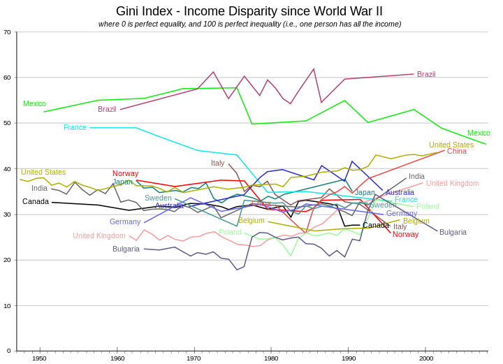
For Hong Kong & Singapore, I suspect the inequality may be worse than listed because the coefficient doesn't take into account several factors like housing costs (its insane to buy a decent home in Singapore & HK without being rich). For the USA, I'm surprised its so high considering there is still a decently sized middle class there (though shrinking every year). Below, I also show historical Gini coefficient, notice how many countries are increasing in income inequality over time.
Very interesting to note that the top developed countries (is South Africa considered developed? Iffy in my opinion) on the list would be:
1 - Hong Kong (53.7)
2 - Singapore (47.8)
3 - USA (45.0)
4 - South Korea (41.9)
5 - UK (40.0)
Its a bit sad that these countries (esp #1 & 2) are on the same level as places like Guatemala, Zimbabwe, Madagascar, and China. I'm not exactly a socialist or communist but large distributions of wealth and poverty is never a good thing. Having traveled to many of the countries here, its really appalling to leave the nice snazzy hotel and see tarps/tents on the road median just in front with families huddled together beneath it.
For Hong Kong & Singapore, I suspect the inequality may be worse than listed because the coefficient doesn't take into account several factors like housing costs (its insane to buy a decent home in Singapore & HK without being rich). For the USA, I'm surprised its so high considering there is still a decently sized middle class there (though shrinking every year). Below, I also show historical Gini coefficient, notice how many countries are increasing in income inequality over time.
| ||||||||||||||||||||||||||||||||||||||||||||||||||||||||||||||||||||||||||||||||||||||||||||||||||||||||||||||||||||||||||||||||||||||||||||||||||||||||||||||||||||||||||||||||||||||||||||||||||||||||||||||||||||||||||||||||||||||||||||||||||||||||||||||||||||||||||||||||||||||||||||||||||||||||||||||||||||||||||||||||||||||||||||||||||||||||||||||||||||||||||||||||||||||||||||||||||||||||||||||||
| ||||||||||||||||||||||||||||||||||||||||||||||||||||||||||||||||||||||||||||||||||||||||||||||||||||||||||||||||||||||||||||||||||||||||||||||||||||||||||||||||||||||||||||||||||||||||||||||||||||||||||||||||||||||||||||||||||||||||||||||||||||||||||||||||||||||||||||||||||||||||||||||||||||||||||||||||||||||||||||||||||||||||||||||||||||||||||||||||||||||||||||||||||||||||||||||||||||||||||||||||
Tuesday 24 September 2013
Easy come, easy go!
The Fed taper surprise last week really caught the markets off guard and led to a big rally. Oh how short lived that rally was!
Just 4 short days later, we're now below where the S&P 500 was when the taper delay rally started. A bit surprising. Did the market already priced in a delay (I don't think so), did the market realize that the delay doesn't mean that much (likely, taper will happen in Dec or so likely now).
Much ado about nothing after all?

Friday 6 September 2013
Why the Declining Unemployment Rate is Deceptive
Guest Post - Today I'll like to introduce a guest post from Daniel Noon, a Ph.D. student at UCLA, courtesy of Otavio Dalarossa, an Los Angeles investor. He digs a bit into the true meaning of the job situation.
Reading between the lines and spotting uneasy trends
Is the job situation really recovering? The unemployment rate seems to indicate that it is, having declined from 10% to 7.6% since October of 2009. While most economists take this statistic to be a credible measure of broad economic conditions, an alternate unemployment measure shows a starkly different picture.
The employment-to-population ratio measures the number of people who have jobs relative to the number of people of eligible working age as its base. This metric, as well as the unemployment rate, are both maintained by the Bureau of Labor Statistics. The key difference between the two is that the unemployment rate uses the much more restrictive labor forceas its base. The labor force excludes those who have given up looking for employment, yet who say they "want a job now"- this results in a rosier unemployment rate figure. (Source: http://www.bls.gov/cps/cpsaat35.htm).
The chart below compares the unemployment rate to unemployment measured by the employment-to-population ratio with data from 1948. Both unemployment metrics appear to generally move in tandem together during each job boom and bust cycle. The two metrics have been undeniably consistent with each other with respect to their movements over much of US history.

However, this does not hold true for the most recent timeframe. After the 2008 crash, the unemployment rate rose, peaked out on October of 2009 and has been on a steady decline ever since. Unemployment measured by the employment-to-population ratio similarly rose with the unemployment rate after the crash, but has remained flat during the supposed recovery instead of declining (see plot below).

Why is this happening? This can be explained by a stagnant or contracting labor force relative to the country's growing working population. The labor force, central to the unemployment rate's definition, excludes individuals who have essentially given up looking for work. In 2007, the BLS reported that 4.7 million working eligible individuals were "not in the labor force but wanted a job now." This figure has risen each year since 2007 and hit 6.6 million in 2012, a trend that contrasts a job recovery notion. These figures help explain some of the recent discrepancy between the two employment metrics.
Those who are considered unemployed by the alternate metric are effectively categorized by BLS as "not in labor force, do not want job now." When this category was adjusted for population growth, it experienced an unprecedented surge concomitant with the onset and aftermath of the Great Recession: a rate of increase about substantially worse compared to the early 2000s when the dot-com bubble burst and 9-11 occurred (see table below).
Timeframe | Average Annual Growth Rate in “not in labor force, do not want job now” normalized to 1994 population of working-age individuals |
1994-2008 | 0.4% |
2000-2003 | 0.8% |
2008-2012 | 1.3% |
While it is difficult to figure out exactly why this has happened, it’s easy to be skeptical and wonder how many do want a job and are unwilling to admit to it, or are subject to flawed survey procedures. In fact, BLS adds a footnote to some of its “not in the labor force” tabulations admitting that some individuals are not even asked if they want a job (see below).

With the labor force as a persistent point of debate between supporters and opponents of the unemployment rate, these charts suggest that the employment-to-population ratio could function as a more honest measure of jobs in the economy. For investors seeking to look into real job figures for additional data on the economic picture, this metric may prove to be very useful.
Subscribe to:
Posts (Atom)